By Cody Burkhart
A little something for the kids…
The Question: What is your objective?
The Baseline. What is your initial state?
Re-test v. Real Time. How do you want to track your progress?
Supplementary Data. What extra information helps you draw deeper connections?
We have covered each (in case you are just joining us… you can catch up here) and are left with the Grand Poobah: The Analysis. As I said before, this is “the math stuff, the ‘how did it feel’ stuff, the biochemical stuff. The stuff that starts to help generate understanding.”
I want to place emphasis on that final sentence. Generate. We are not suddenly going to receive a parting of the clouds with rays of omniscient information raining down upon us (unless you have an incredibly robust subconscious brain). We need to start fiddling with our data, throwing it on the floor in front of us, on a white board in the office or gym, or digitally into spreadsheets and plots. Often times the pattern is right in front of us and we just need to help our brain connect the dots. Right now, this is where you should be: a tally of data points over the past two weeks waiting for me to deliver you a golden key of an excel spreadsheet to unlock all the answers. It may not be a golden key, but, as promised, you will find an attachment below to the spreadsheet I created. (A brief paragraph on how to use the spreadsheet is at the end of this post lest it become a foreign language to you and, therefore, unusable – tm-test-the-analysis). So, what did the data show? Not so fast… let’s give you some visuals to help out first. These are the plots my spreadsheet will produce for you and your data (all dependent upon what you collected):
For reference:
Blue – Baseline Test
Orange – Day 1
Grey/Black – Day 2
Yellow – Day 3
Green – Re-Test
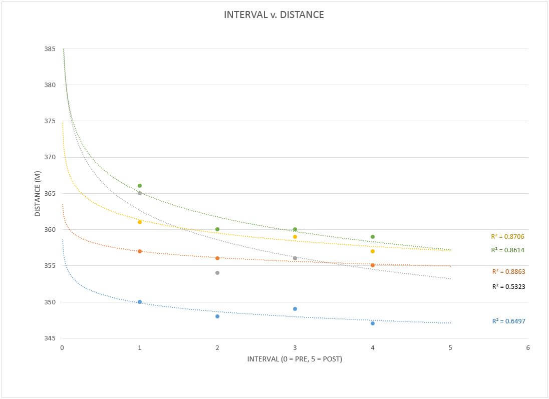
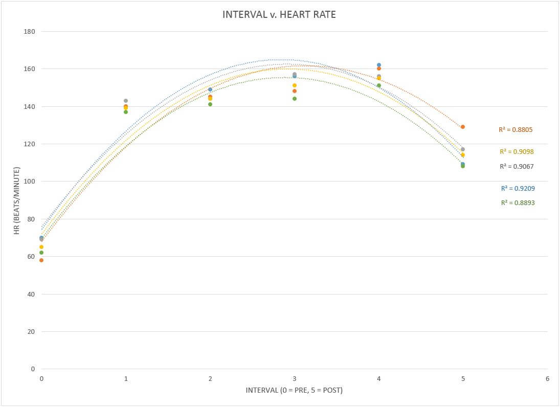
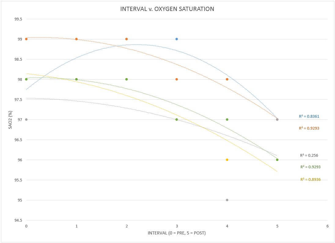
A bunch of colors, some crazy ass numbers, and lines that look like rockets fired in an old school MS DOS game. You may be overwhelmed at first, while others of you may be completely comfortable in this space. Either way, be open to what’s to come. First, a clarification. What is the R2 value next to each trendline? Well, trendline is your line of best fit: the guestimate of what your data points have in common. This line can be made by using many different mathematical equations from linear (does y=mx+b ring a bell) to power functions and exponentials. In statistics “R squared” is known as the coefficient of determination. The fancy words will say things its “main purpose is the prediction of future outcomes or the testing of hypotheses, on the basis of other related information” (Wikipedia, coefficient of determination). All that roughly means is that by displaying the R2 value, I can test out, essentially, how accurate of a guess my trendline selection is to the data set. The closer to 1, the more accurate the selected math model is to my data. Now, the point is not to go with whatever option from the menu gets you closest to 1, but, rather, to examine the different options and their coefficients as you gain an understanding of your experiment. You can start to see patterns that you may not have seen before and then you can start correlating them to what makes sense.
What does that mean? Let’s focus on an example:you take all your distance data from the rows and plot them in the excel spreadsheet. You notice you have an R2 value of 0.8 for roughly each data set using a 2nd order polynomial line of best fit (2nd order polynomials make one hump aka the parabola, 3rd order makes two humps aka an “S”, etc.) You decide to tinker with the trendline and change your baseline to a 5th order polynomial, giving you a much higher R2 value of 0.95. When you apply the same option to the rest of the data sets, however, you notice that while some increase, others decrease… one even drops below 0.5. While there are some case that using different trendlines within a single data set can help identify specific behaviors of a system, we typically don’t want to judge things based on different sets of rules. Double standards seem to cause all sorts of fun in the world. Don’t add to it with your mad scientist work. (If you don’t believe me try to tell a 5 year old why he can’t do something that you can do). Rather, I encourage you to except that one of the “big four” usually gives you the highest overall R squared value for all the data sets in your plot. Those “big four” are: linear, exponential, logarithmic, and polynomial (2nd order). If you want to get thick into the weeds, grab a statistics book or start chasing the dragon on the internet.
In the case of the data I collected, I felt comfortable keeping the polynomial (2nd order) parabola across the board for my data sets. How did I come to this conclusion? The same way you can come to a similar conclusions with your own data and any data you may test/analyze in the future. Consider what is happening in our base measure of distance: I am performing intervals at my max effort, but as each interval comes along I am going to get more and more fatigued. The likelihood of my performance being as high in the rounds to follow becomes less and less likely. I relate this to shooting a bullet at a target. If I shoot in exactly the same place but move my target to farther and farther distances between shots, I will notice that it may be dead on for the first 100, 200, maybe even 300yds, but eventually it starts to drop and then eventually it falls off. Just like me on the rower.
If you remember back a few weeks, I picked my interval distance because I knew I would reach the point where I stopped focusing on my rowing position and skill and start focusing, instead, on pure survival. I will assure you I went to my limit. The shear amount of pain my legs were in after the final round would have made for a great gif. I would walk like two steps and then lay down, roll around helplessly, then try to stand back up and walk… only to end up sitting in a nearby chair only five steps further. I even tried getting on a treadmill at one point just to move blood and found myself barely keeping pace at 1.2mph as each step suggested my legs might collapse under me. Know the limits, but make sure they know you aren’t afraid to test them a bit.
All recovery antics aside, this is the common projectile math of middle/high school physics class and we all have seen the image of a projectile path (the basketball shot arch) looking like a parabola. Since my performance, in my experience, would follow a similar slow reduction until sudden degradation process, the parabolic best fit seemed ideal. When I compared it to the other three in the “big four” across (and this is key) all my data sets, it also had the highest averages for my R squared.
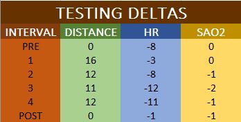
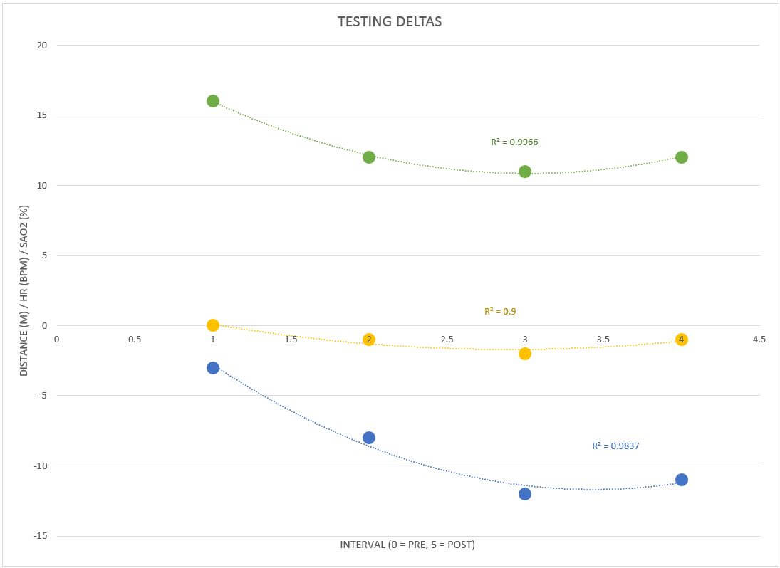
I tested my hypotheses against the math and received confirmation. Sometimes you may not have your concept match the data. Sometimes the big four won’t cut it. Sometimes you have to throw out data points to get a really solid grasp of what is going on (this is exemplified in the deltas plot of my test vs my retest values… I removed the pre measure and post measure to see how my body behaved during the workload). It’s a game and, just like any game, you will get better at it the more you do it. You will also get better at it the more information you bring to the table on the topic. For instance, even though I may know how gravity works, without more research on its effects on orbiting bodies and studying Newton’s Laws of Motion, it will be hard for me to understand why the golf ball I just crushed is quickly making its way to Jupiter instead of coming back to the ground.
It’s examples like this that are driving the next move I will be making with you: I am not going to give you any answers this week.
This is not the analysis post you were expecting, I know. Sorry, I’m not sorry. Remember when I said the training wheels would be coming off? This is phase one. Rest assured, we will get into what all the numbers mean and you will have the breakout you want, but, for now, I want you to input your data, read a few topics, and start drawing some conclusions before I begin shoving my own brain propaganda down your throat. I want you to push your own limits. This way you can predict how you could do things differently for your own outcomes; remember my body may react totally different than yours and that’s the entire freaking point of this blog. Don’t just read my stream of words and be a “yes” man/woman, apply the concepts in their most basic form and empower your own understanding.
You have the excel sheet with examples above on how things will look when you are done. We also covered how trendlines worked to prepare you to read the information you are seeing on the screen. That’s the nuts and bolts of the hardware, but the actual components will require homework this week. To help, here is a list of topics to chase after and get acquainted with… you don’t need to marry the ideas, just speed date them and the ones you like the most can be taken out for dinner and a movie:
- Energy systems and metabolic pathways
- Lactic Acid and the difference between aerobic and anaerobic
- Blood glucose and gluconeogenesis
- Hydration and the pump mechanisms that move fluid into and out of a cell
- Myelin and how it relates to skill development
- Parasympathetic and Sympathetic responses in the body
- Shared communication channels between the heart and the brain
There are literally lifetimes of data in each category above. Don’t try to become an expert. Try to find things that connect back to what your data suggests. If you were like me and saw a lower heart rate response from the intervals in your re-test as compared to your baseline… what could be causing it? What does it all say about why you did better or worse with the mask on? Does it have any relationship to why you stumbled around the gym with open consideration to rip your legs off your body instead of dealing with their implosion? If you didn’t test, look at my data and plots. Imagine they were your outputs… this is not about you all having done the test, but about figuring out how to read it and react to it.
When we meet again we are going to talk about overarching principles of the analysis and then we are going to start jumping into each one on its own, exploring the depth and breadth of what it has to offer, and see what other cool experiments we want to try by the time this is all over. To me, it’s not enough to learn a few things and say “hmmm, news to me” and move along. I want to slide into home plate in shorts, face first, screaming.
How to use the spreadsheet: tm-test-the-analysis
The set-up is rather simple. I assumed 6 total days of workouts. This allowed for a baseline test, 2x/week of the TM application, and one more post processing redo of the baseline. If you have less data points, like I have in my version, you will see in the plots that you can edit the data via the Design tab of the tool ribbon at the top. Simply deselect the days data you don’t have on each plot to de-clutter the output. As is stands, the spreadsheet expects you to place your info in on the left column and it will auto populate the rest of it through for you into the larger plot table. The colors of each specific data set are also included to the left of this second “cumulative data” column. This way you can easily figure out which trendline you are looking at on each particular plot. You may not have all the supplementary data that I do, but you should at least be able to plot the distance based on the interval and the delta plot (located in the middle, bottom). If you have extra days to add, follow the structure I made and you should be able to set it up with no issues. I added a trendline to the data sets, for this one it was a second order polynomial for each, and I clicked the “Display R squared value” radio button to show how close the trendline was to collecting the precise nature of the data set.
If you have questions or issues, let me know via an email to [email protected] or a comment below.
Download tm-test-the-analysis spreadsheet
